


Much of the information we consume is fed to us algorithmically by computers in the form of memes, social media posts, brief video clips, and other short forms of media. (Editor’s note:Yes, that was Taylor Swift’s name in the article title. That’s not click-bait. We will bring the subject of Taylor Swift a little further down into this article. Be patient and read along as we lay the foundations to make her carbon footprint relevant to this article).
When something goes “viral,” people register a “like” or comment and then pass it along to others without much thought, similar to a biological virus. Before you know it, whole segments of the population are potentially “infected” by misinformation. Although it’s not always intentional, misinformation is a real problem in today’s society. In a previous article, I wrote about a related concept called The Matthew Effect. With the rise of generative AI (artificial intelligence), the problem is likely to get worse. In fact, many media outlets are considering putting warning labels on AI-generated content.
We live in a noisy, data-drenched world, and yet truth is such a rare commodity. I’m reminded of that famous line, “Water, water everywhere and not a drop to drink,” in Samuel Taylor Coleridge’s poem, ‘The Rime of the Ancient Mariner’. In the poem, those lines are spoken by a thirsty mariner who is adrift at sea but unable to drink from the saltwater sea. It conveys a sense of irony and despair of being surrounded by something in abundance yet being unable to use it. As a society, I think most of us thirst for the truth. Here’s my modern take on that famous poetic line:
Data, data everywhere,
yet seldom do we think.
We are literally surrounded by data. When you are born, you get a social security number that’s a form of data to establish your identity and track you for the rest of your life. In school, you have report cards, test scores, and grades that go into your academic transcript. Everything you do online is tracked. Everywhere you go is tracked by GPS or a roadside camera. Organizations and governments capture data. Medical providers keep data on patient care. Insurance companies keep data on claims. Stores keep data on sales transactions. Banks and credit agencies use data to assess risk and account for financial transactions. Your personal preferences are noted and captured by social media, streaming music outlets, and video services. In short, there’s no shortage of data everywhere about everything. The abundance of data has advantages and disadvantages to society. We can examine the disadvantages and concerns in a future article.
In our quest for the truth, let’s turn our attention to the advantages of having so much data. A quality, original source of data has the potential to provide indisputable, unfiltered truth. Most of us rely on traditional forms of news information in which a human author (or AI) attempts to summarize, explain, or elaborate on something that we assume started as facts from an original data source. Conventional journalism often relies on interviews, observation, and qualitative analysis. This is very helpful when done correctly. It’s not always easy or straightforward to get insight from raw data. On the other hand, the potential for abuse and bias increases as layer upon layer of commentary drifts away from the original, underlying truth.
Data journalism is a relatively new term that flips the story-writing process upside down to start with the data, not the human commentary on the data. It adds a quantitative dimension to stories, research, and investigation. Although the term is new, the concept isn’t. Data journalism was inspired by investigative reporting based on open records requests, meeting minutes, transcripts, data charts, budgets, and other forms of data. Specifically, data journalism is concerned with mostly numerical data since numbers tend to be less nuanced and most objective than words. During the COVID-19 pandemic, the publisher of this paper used data journalism by reporting on the numbers such as those discussed towards the end of the pandemic.
So what is data journalism? One commonly accepted academic definition suggests the practice of data journalism is “a way of enhancing reporting and news writing with the use and examination of statistics in order to provide a deeper insight into a news story and to highlight relevant data. One trend in the digital era of journalism has been to disseminate information to the public via interactive online content through data visualization tools such as tables, graphs, maps, infographics, microsites, and visual worlds.” (Antonopoulos, Nikos; Karyotakis, Minos-Athanasios (2020). The SAGE International Encyclopedia of Mass Media and Society. Thousand Oaks, CA: SAGE Publications, Inc. p. 440).
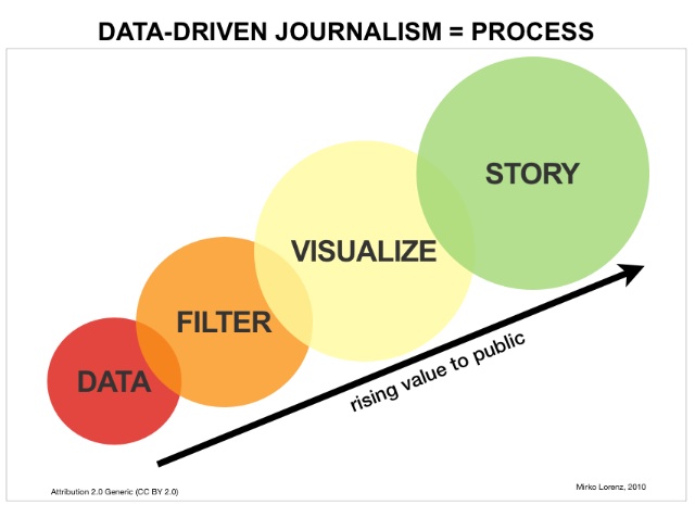
As someone who’s been working with data most of my professional career, my own definition of the term is that data journalism is the use of computer technology, statistics, and data visualizations to help tell a story. Whereas traditional journalism may include a graph or chart, data journalism makes that a central feature. Data journalist Mirko Lorenz says that “data-driven journalism is primarily a workflow that consists of the following elements: digging deep into data by scraping, cleansing, and structuring it; filtering by mining for specific information; visualizing and making a story.” Here’s an example from the Atlanta Regional Commission.
Source: Atlanta Regional Commission – 21-County Data Dashboard
This approach to reporting relies on three activities: accessing a quality data source, analyzing (aka “interrogating”) the data to understand it, and visualizing the data into a graphical format that tells a story. Examples of data visualizations include infographics, database listings, data-enriched maps (like Google Maps), dashboards, interactive graphics, charts, and even 3D virtual reality explorations. Data journalism tends to rely less on words and more on pictures – but pictures based on original data sources.
There are many advantages to data journalism:
- Enhanced Objectivity: Data visualizations based on original sources tend to be less susceptible to personal bias.
- Greater Depth and Context: It’s been said that a picture is worth a thousand words. Visual storytelling allows the reader to explore information in a deeper, more meaningful way than traditional word-based media.
- Higher engagement: The ability to see and explore data “hands-on” is more fun and engaging for the audience. Take a child to a science museum with interactive exhibits and compare that to a science textbook to see what I mean.
- Increased comprehension: Data presented in an interactive format encourages readers to explore the information themselves, leading to greater insights and understanding. Instead of being told what to think, the reader has to use their own brain to draw conclusions.
- Uncovering new insights: Data visualizations often uncover patterns, trends, and knowledge that’s not obvious in a traditional written story.
There are some disadvantages to this approach to journalism as well:
- Increased complexity: Even though a visual approach to storytelling has the potential to be more user-friendly, it does require the target audience to use their eyes and brains. Some people like to be told what to think, so data journalism wouldn’t be appropriate for them.
- Risk of Misuse: Statistics and graphs can be misused to skew or distort the truth. Correlation is not the same as causation. Look that one up.
- Risk of misinterpretation: Even if the visualization is sound, the target audience may be confused and make improper interpretations contrary to the facts. This problem isn’t unique to data journalism; all forms of communication are subject to misinterpretation.
- Bad data: Proper data journalism requires accurate and available data. Beware of data visualizations that are based on incomplete, outdated, or biased information. Always look for the original data source citation and avoid homemade infographics with no citation.
- Privacy: The right to privacy and the right to know are two, often conflicting societal goals. On one hand, the proliferation of data has made life easier. On the other, it’s made it harder than ever to live a private life. Most data-driven stories avoid personal data unless it involves a public figure.

Here’s a recent situation regarding data journalism. Does the public have a right to know where Taylor Swift travels in her private jet? A young data journalist has been using publicly available data to publish information about her travels.
Taylor Swift launches legal salvo at student who tracks private jets via public data
(Source – ABC News website, 2/7/24)
Does the public have a right to know, or does Taylor have a right to fly in privacy? Some have even correlated the flights with the carbon footprint it leaves behind, noting the potential hypocrisy in Swift’s public comments related to global warming.
Why Taylor Swift’s globe-trotting in private jets is getting scrutinized
(Source – AP News website, 2/7/24)
By the way, as I was writing this story, there’s been some breaking news that Taylor Swift sold her jet amid the uproar. Regardless of how you may personally feel about the story, this is a great example of the impact made by data journalism.
My intention isn’t to pick on Taylor Swift. Quite the contrary, I don’t mind admitting that I enjoy her music and think she’s quite talented. In fact, congratulations to Taylor Swift’s boyfriend Travis Kelce on the Kansas City Chief’s win at the Super Bowl. What a game!
Anyway, back to the main article theme. By using data journalism many things we assume are true based on a single headline just don’t stand up to scrutiny. In the broader discussion about carbon emissions, one would think the United States is the worst offender based on the news. Consider the following data visualization.
Not only is it not true that the US is the worse offender, carbon emissions in the US are on the decline. China is the worst offender and their carbon emissions are growing. The data speaks for itself. I’ll leave it to the reader to put their own interpretation of what this signifies.
So, what does all of this mean for you and the readers of this newspaper? In the upcoming weeks, I will be working with the publisher to create and publish some new features that use data journalism methodology. Some of these features will start as simple data aggregation features, but over time we hope to create some fun and compelling data visualizations based on real and relevant data. In all cases, we will cite the data sources (just like it’s done in traditional news stories) and when possible provide a direct link to those sources.
Our goal? To provide the discerning reader more opportunities to discover the truth for themselves. There is a wealth of publicly available data produced by our local, state, and national governments. At the local level, both of our two largest municipalities have gone to great lengths to provide more data and communications to the citizens – that’s good, and I have personally thanked both mayors for their efforts in communicating with the public using different methods. Yet, we all know that a free press is a good thing for a community. The online edition of this newspaper was one of the original news sites that goes all the way back to the late ’90s. An online strategy has always been an integral part of the operation at The Citizen. We aim to take that to the next level by adding quality data journalism to the mix.
So, what would you like to see? Let us know, and we’ll look into it.
[Joe Domaleski, a Fayette County resident for 25 years, is the owner of Country Fried Creative – an award-winning digital marketing agency located in Peachtree City. His company was the Fayette Chamber’s 2021 Small Business of the Year. Joe is a husband, father of three grown children, and proud Army veteran. He has an MBA from Georgia State University and enjoys sharing his perspectives drawing from thirty years of business leadership experience. Sign up for the Country Fried Creative newsletter to get marketing and business articles directly in your inbox. ]


Leave a Comment
You must be logged in to post a comment.